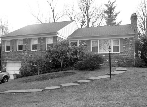
The couple never liked the looks of their 1950s rambler, but they loved the neighborhood too much to leave it. Expanding the house didn’t seem like an option, as Maureen was concerned that a second-story addition might tower over the neighbors and feel out of scale. Then she met with local architect Jim Rill, who saw Craftsman echoes in the rambler’s massing and roofline, and proposed transforming the house into an Arts and Crafts bungalow with a second story tucked into pop-up dormers.
Houzz at a Glance
Who lives here: Maureen and Ray O’Bryan, with visits from Colin (age 26), Brendan (24) and Claire (19)
Location: Bethesda, Maryland
Size: 2,900 square feet; 6 bedrooms, 5 bathrooms
Year built: Mid-1950s; remodeled in 2012
Before Photo
Rill Architects
“We never cared for the look, but it was what we could afford at the time,” Maureen says of the house that she, a retired nurse, and Ray, an accountant, purchased back in 1993.
“My children never had a lot of friends over, because there wasn’t space,” she adds. In fact, guests always ended up in the basement, because it was the only space where the family could comfortably entertain — although it meant that Maureen was often stranded alone in the kitchen upstairs.
“My children never had a lot of friends over, because there wasn’t space,” she adds. In fact, guests always ended up in the basement, because it was the only space where the family could comfortably entertain — although it meant that Maureen was often stranded alone in the kitchen upstairs.
Rill Architects
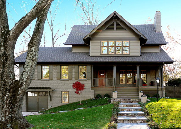
AFTER: The most dramatic changes were made outside, where the old rambler got a new second floor and new roofing, including a part that overhangs a new front porch.
“It’s all about the slope of the roofs — that’s what made the transformation to Arts and Crafts work,” says architect Rill, who collaborated on the remodel with project manager Kay Kim and Woodhaven Contractors.
The existing brick was painted, and the fake shutters were replaced, helping to relieve the house of its Eisenhower-era aura.
Rill Architects
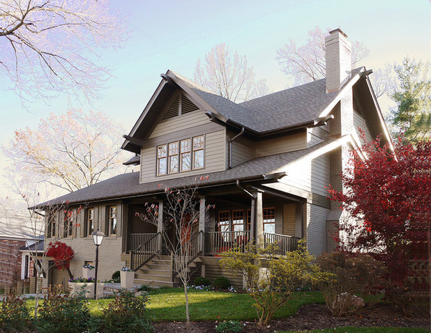
By tucking the second floor into the roofline, Rill was able to diminish the addition’s scale, which was Maureen’s biggest concern.
Initially she objected to painting the house olive, but Rill encouraged her to extend the Craftsman theme into the color palette. “I didn’t know that choosing the Craftsman look was going to tie us in to this color palette,” Maureen admits. “In the end I loved it.”
The ground floor was expanded in back to accommodate the new family room, as well as a new deck. The remodel ended up adding 1,200 square feet to the 1,700-square-foot home.
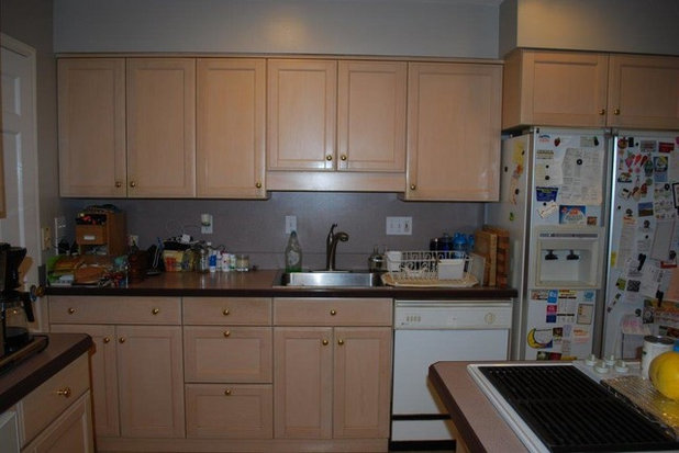
Before Photo
Maureen is an accomplished cook, and a new kitchen was a top priority. Although she and Ray had redone the kitchen in the early ’90s, it still wasn’t big enough for Maureen’s collection of cookware (she was constantly traipsing down to the basement to retrieve something), and the appliances and finishes were starting to look pretty dated.
Rill Architects
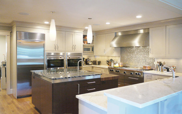
AFTER: Maureen longed for a sleek, modern kitchen with professional-style appliances, two ovens and loads of storage. She got all that and more. The new kitchen — designed in collaboration with Aidan Design — incorporates parts of the old kitchen, daughter Claire’s room and some of the bump-out in back.
The old cabinets and appliances were donated to Habitat for Humanity. (Find out more about Habitat’s stores and donation centers here.)
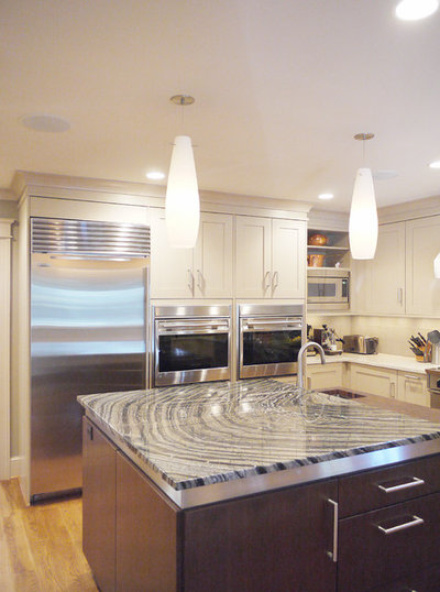
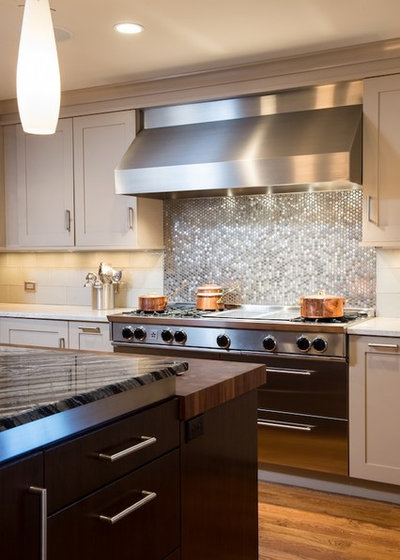
Wall ovens: Wolf; hood: Vent-a-Hood; refrigerator: Sub-Zero
The old cabinets and appliances were donated to Habitat for Humanity. (Find out more about Habitat’s stores and donation centers here.)
Wall ovens: Wolf; hood: Vent-a-Hood; refrigerator: Sub-Zero
Rill Architects
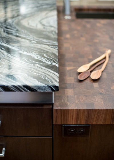
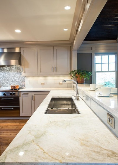
White Brookhaven cabinets from Wood-Mode surround a contrasting walnut island topped with a sheet of Cosmos granite. Originally the island was supposed to have Taj Mahal quartzite counters, like the rest of the kitchen. But when the slab arrived, it had an unsightly vein running through it, and no more could be found, so the designers proposed the Cosmos instead.
“It looked like a petrified tree with the rings coming out,” observes Maureen. “This was really going to make a statement, so I thought, ‘Let’s go for it.’”
“It looked like a petrified tree with the rings coming out,” observes Maureen. “This was really going to make a statement, so I thought, ‘Let’s go for it.’”
Rill Architects
The 60-inch BlueStar range is backed by a field of stainless steel penny round tiles that Maureen had admired in a showroom (but found online for less than half the price). The backsplash on either side is covered with 6- by 12-inch glass subway tiles from Architectural Ceramics.
Rill Architects
The tiered island includes a butcher block prep surface and an elevated granite counter, where Ray — who stands 6-foot-3 — finds it easier to work.
Rill Architects
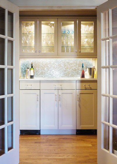
Part of the old kitchen was turned into a pantry, where Maureen can access all her serving pieces, extra glassware and frozen foods. (She opted to put a freezer in the pantry instead of the main kitchen.)
Rill Architects
An expansive pass-through and breakfast bar divide the kitchen from the adjoining family room. “Sunday morning Ray sits at the breakfast bar and reads his newspaper while I fix breakfast,” Maureen says. “When we have company, everyone can be around me, and it doesn’t impede on my cooking space.”
Rill Architects
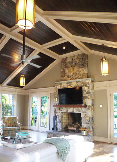
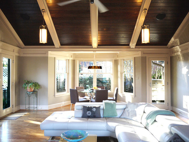
“Maureen loves to cook for other people,” says Rill, “so the idea was to create a big but cozy family room.” The room is housed inside an addition at the back of the home.
Although the O’Bryans lost their formal living room in the remodel, they never used it anyway and say they much prefer entertaining friends here.
Although the O’Bryans lost their formal living room in the remodel, they never used it anyway and say they much prefer entertaining friends here.
Rill Architects
Ray used to retreat to the basement to watch TV. Now he can do it in the family room while Maureen works in the adjacent kitchen. Meanwhile, the basement was turned into a suite for son Colin.
Rill Architects
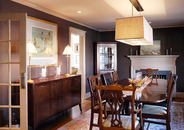
The O’Bryans like to entertain but could never seat as many people as they wanted in the dining room. So Rill turned the former living room into the dining room and painted the space eggplant to give it more of an intimate, Craftsman-inspired feel.
The former dining room was turned into an office for Maureen; the family room at the back of the house takes the place of a formal living room.
Although most of the interior spaces were changed to some degree, Rill resisted moving walls as much as possible, to help keep remodeling costs down.
Chandelier: Restoration Hardware
Rill Architects
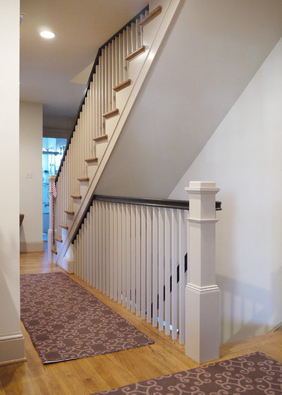
Since there was no second floor before, the architects had to add a staircase, which they placed atop the old basement stairs, where a closet used to be. They opened up the basement stairs in the process to make the descent less constricted and more appealing.
Rill Architects
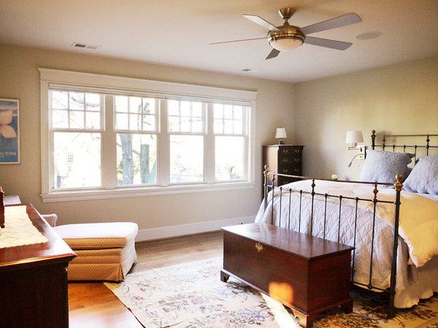
The new second floor includes a master bedroom and an office for Ray that could be used as a nursery by a future buyer. Maureen says she and her husband kept resale in mind throughout the remodeling process.
Rill Architects
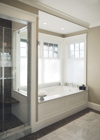
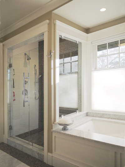
Maureen’s directive on the master bath was to “make it fun,” and the architects complied, providing a delectable tub that feels like it’s nestled in the treetops.
Rill Architects
The O’Bryans’ old shower was so small, you had to enter it sideways. That’s no longer a problem. The new shower offers ample room and has two glass walls, making it feel even more spacious than it is.
Rill Architects
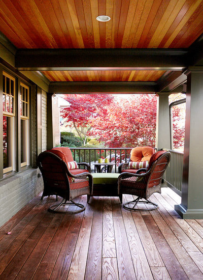
The old house had a front stoop that was so small, you had to step out of the way to open the storm door, and there was no interaction with the street. So Rill added a generous porch in front. “We love sitting out on our front porch after dinner,” Maureen says. “We’ll have our cocktail out there and wave to the neighbors.”
Rill Architects
SInce the remodel was completed, sons Colin and Brendan have both returned home for extended stays, and daughter Claire visits, so the extra space has come in handy.
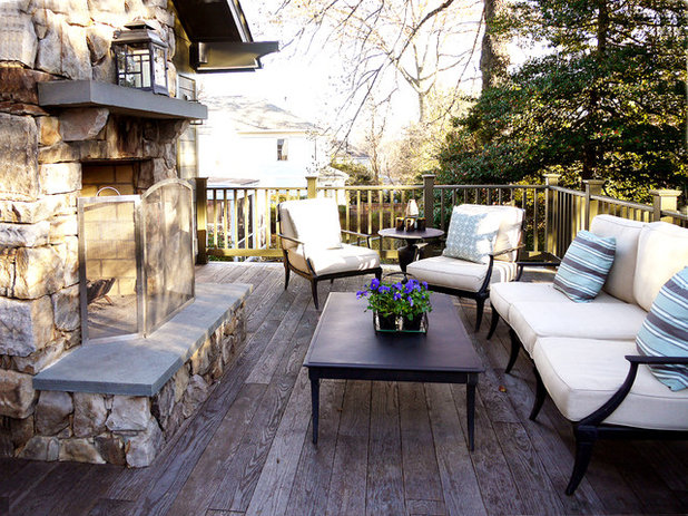
When the weather’s nice, friends congregate on the back deck to toast marshmallows or to partake in Maureen’s latest passion, beer pong.
Clearly, a retirement community wasn’t an option.
More:
Roots of Style: See What Defines a Craftsman Home
Movin’ On Up: What to Consider with a Second-Story Addition
0 comments:
Post a Comment