Here’s how a designer transformed a bathroom with bad lighting, a tub no one used and decor meant for a young girl into one a teenage boy loves, with timeless style that will work for houseguests long after he moves on to college.
Photography by Wing Wong
Tracey Stephens Interior Design Inc
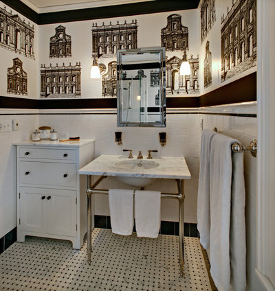
“I knew I wanted a black and white color scheme; the challenge was using just the right amount of black without going overboard,” says interior designer Tracey Stephens. “With each item we brought in, I had to decide if it would be black or white.” A 6- by 6-inch black tile border around the floor anchors the room, while other smaller black details punctuate the white in all the right places.
Stephens also needed to make the room larger, both physically and visually. She grabbed a bit of square footage by reversing the swing of the door and incorporating a hall closet into the footprint of the bathroom. She also removed the bathtub-shower combo and replaced it with a large shower stall. A recessed medicine cabinet utilizes extra storage space in the wall. The new floor plan is 7 by 9 feet.
Several smart moves created more visual space. “The console sink with legs helped open things up, and I love that it has towel bars built into it,” she says. Stephens reused the cabinet to the left from another project she had worked on with the same clients in their former home. Tucked into the corner, it provides more space than a typical single-sink vanity would have, without being a space hog. “I love to reuse items wherever possible; all we had to do was replace the top with Carrara marble to match the sink, and the knobs with vintage black glass,” she says.
Tracey Stephens Interior Design Inc
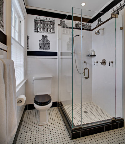
“Using a frameless, clear glass shower enclosure makes the room feel more spacious,” Stephens says. “I’ll often use a half wall of tile with these enclosures, but all glass is just better in here.”
The vintage-style toilet befits the turn-of-the-century home. Stephens had to search high and low for the perfect seat for it; this one is ebony-stained maple. “It was a great chance to add more black,” she says of the strong contrast.
Towel bar, toilet paper holder: Newport Brass; toilet: Toto; toilet seat: Lefroy Brooks
White Toilet, Black Lid: Trending in a Bathroom Near You
Tracey Stephens Interior Design Inc
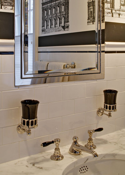
Small details, like the black porcelain faucet handles and the black wall-mounted glass cup and toothbrush holders, were great chances to add black as well. Pencil-line trim above the chair rail and Absolute Black granite around the shower floor were two more opportunities for punctuating with black.
All tiles and fixtures: Waterworks; medicine cabinet: large framed inset in stainless steel, Restoration Hardware; sconces: Urban Archeology
All tiles and fixtures: Waterworks; medicine cabinet: large framed inset in stainless steel, Restoration Hardware; sconces: Urban Archeology
Tracey Stephens Interior Design Inc
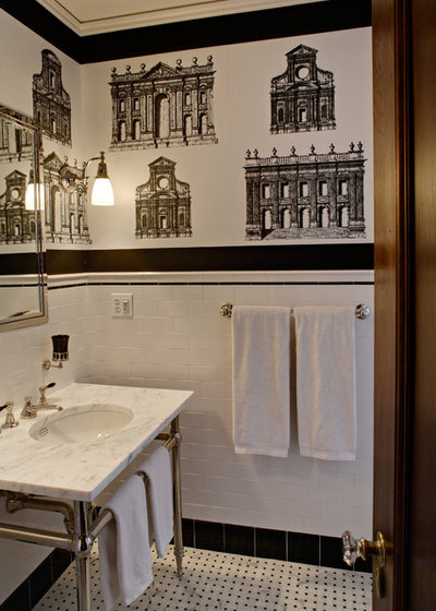
Now, about all that measuring and cutting: Stephens knew she needed something decorative between the chair rail and the ceiling. Knowing that the family had just returned from Rome and that they all shared a passion for classical architecture, she found this wallpaper and showed it to them.
They were smitten, but there was a problem. There were only a few feet to display the buildings on the wall, and there was a half drop in the pattern. See how all of the buildings are lined up horizontally across the room? They don’t on the roll. So each stack of two buildings is one piece of wallpaper, and each stack of two had to be cut from the roll and meticulously lined up. To top it all off, the black bands at the top and bottom were cut from a black and white striped wallpaper to finish it all out perfectly.
“You know how you say, ‘When am I ever going to use this math?’ when you’re in school?” Stephens asks. “I had to use a lot of math laying this all out in the next room and cutting it just right.”
She adds, “I don’t usually recommend using wallpaper in the bathroom, but we got an expert hanger and invested in a really heavy-duty exhaust fan to fight off the steam. Besides, the family had just returned from a wonderful trip to Rome, and now the wallpaper is almost like a souvenir from the trip.”


0 comments:
Post a Comment