The following three bathrooms — recently uploaded to Houzz by their respective designers — celebrate this approach. Here, the designers dish on their plans of attack, “uh-oh” moments and more.
Tamara Eaton Design
Tamara Eaton Design
1. Going Graphic
Designer: Tamara Eaton of Tamara Eaton Design
Location: Park Slope neighborhood of Brooklyn, New York
Size: About 5 by 9 feet (1.5 by 2.7 meters)
Homeowners’ request: “The clients bought a historic townhouse in Park Slope in Brooklyn and wanted to keep the elements of a townhouse but have fun and modernize the space with their furniture and decor,” designer Tamara Eaton says.
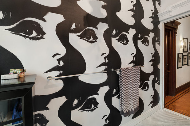
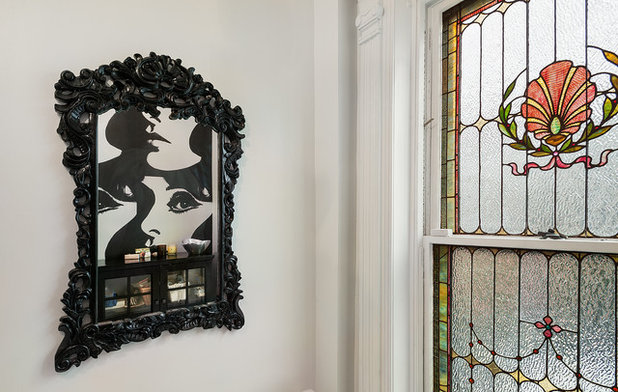
Plan of attack: “The bathroom was a gut renovation, so the architect and I selected light, white finishes for the general bathroom finishes. As the bathroom was done on a tight budget, we saved room for things that really made an impact — chandelier, mirror and wallpaper. We started with a neutral and clean base and then added the glamour in finishing touches.”
Why it works: “The approach of inserting modern details into a historic house was the overarching theme for this project, and was successful as we had such a grand house to work with from the start. A black and white palette in the bathroom allows the stained glass window to stand out as part of the history of the house.”
What wasn’t working: “With the structure of an old house, it didn’t allow for much storage near the sink. This was a problem for a master bathroom, so we added a black cabinet across from the toilet to store linens, toiletries etc.”
Tamara Eaton Design
Designer secret: “One defining thing in a room can really set the tone for the whole space. The graphic black and white wallpaper spells out fabulous in one design move.”
“Uh-oh” moment: “The clients really wanted to change the bathtub into a shower, but when we talked to the contractor and realized how much more expensive it would be (old house!), the clients decided to keep a tub. In fact, the cast iron tub was just reglazed, as it was much less than even purchasing a new tub.”
Splurges and savings: “Not changing the tub into a shower allowed for us to stretch the budget more. Also, we didn’t tile the walls, except for the shower, which gave some room in the budget for other things. The wallpaper was really the splurge here.”
Take-away: “Often, high-impact spaces can be simple and affordable.”
The nitty-gritty: White penny tile: Nemo; mirror: flea market purchase painted black; black cabinet: Overstock; wallpaper: Circa, Phyllis Morris; towel: Missoni; wall paint: Chantilly Lace OC-65, Benjamin Moore; toilet and sink: Duravit
Team involved: Ben Fuqua Architect
Maquette Interior Design
2. A Happy Medium
Designer: Donna McDonald and Anita Ettinger of Maquette Interior Design
Location: Cole Valley neighborhood of San Francisco
Size: About 200 square feet (18.5 square meters)
Homeowners’ request: “This bathroom was one of the rooms renovated in a large-scale overhaul of a three-story Edwardian house,” designer Donna McDonald says. “The homeowner goals were to honor the history of the house while creating a practical, modern home that conveyed their personal style. This is where things got tricky. One member of the couple loves Paris, and tended to prefer antiques and traditional styles. The other’s taste ran toward modern minimalism.”
Plan of attack: “We were brought in during the renovation process, at the suggestion of the architectural firm. Our role was to help select the finishes, fixtures, paint colors and furniture. The cabinets had already been chosen. Because we were in the midst of the renovation, the contractor schedule drove what we selected next. We moved fast and had to get a feel for the clients, their preferences and how they wanted to work fast.”
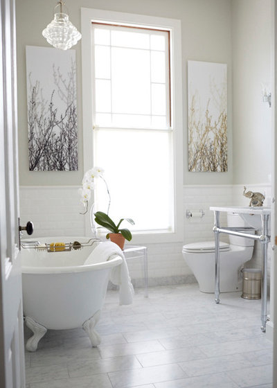
Why it works: “I think the mini crystal chandelier in this bathroom provides a good metaphor for why the space is a success. The chandelier, with its traditional shape yet organic flow of the glass, is simple, beautiful, soft and appropriate for the site yet is contemporary. It provides a touch of luxury [and] a sense of coziness, because it brings the eye down to living level in a room with a very high ceiling. It adds visual interest yet does not clutter. And like the room, it has great proportion.
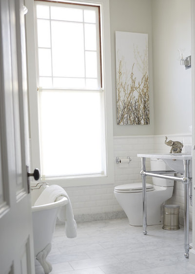
“In the same way, we approached designing the entire room. We took the tall window, which was multicolored, and changed it to clear glass. This let in gorgeous warm light while providing a cleaner look. We used a textured subway tile as a play on the traditional style to add interest and softness. We covered the floor in Carrara marble but used rectangular cuts to provide a more contemporary feel.”
Maquette Interior Design
“The paint was a beautiful soft gray-green — Sea Foam from Benjamin Moore — to bring in the sky and trees outside. The art was from the client and worked perfectly in the space because it did the same thing: married modern and traditional, airiness and coziness, softness with hard materials, interest and clean lines. It also added an organic element, which blended in very well.”
What wasn’t working: “By the time the bathroom flooring was chosen, the owners had significant decision fatigue. To relieve pressure, we chose to use Carrara marble in three out of four bathrooms. Our challenge was to make each bathroom unique using a lot of the same material for flooring and shower walls. We cut the marble differently in all the bathrooms — some hexes, some squares, different sizes. We used wallpaper in one bathroom and forwent wainscoting in another.”
Designer secret: “I think playing with traditional elements and materials to create a clean and more contemporary look made this bathroom a success. The biggest wins were the chandelier, the paint color and changing the window. These changes allowed us to make big strides toward creating an inviting, livable space.”
“Uh-oh” moment: “The lights we specified for the bathroom never shipped. The contractor figured this out at the last minute, when his team was unpacking all the lights for installation. We had to run and get sconces off a showroom floor that would work. Selection was very limited, given that the hole for the J-box was already cut and we needed to match proportion. The sconces we found turned out to be a better fit with the overall look. As my business partner says, ‘Ten percent of any job is bound to go wrong — and most of the time, that is where the magic lives.’”
The nitty-gritty: Tile: Ann Sacks; wall paint: Sea Foam 2123-60, Benjamin Moore; trim paint: Simply White OC-117, Benjamin Moore; Roman shade: David Dawson Upholstery Workroom; fabric: Duralee sheer
Team involved: Huang Iboshi (architect); Saturn Construction
Cindy Aplanalp-Yates & Chairma Design Group
3. “Car Wash” for Kids
Designer: Cindy Aplanalp-Yates of Chairma Design Group
Location: The Woodlands area of Texas
Size: 12½ feet by 7 feet (3.8 by 2.1 meters); ceiling height: 9 feet (2.7 meters)
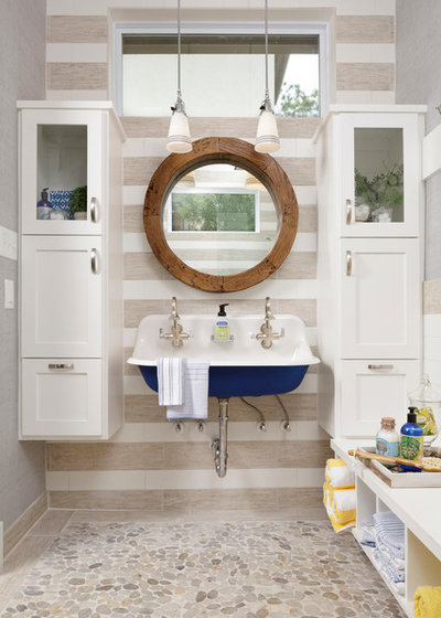
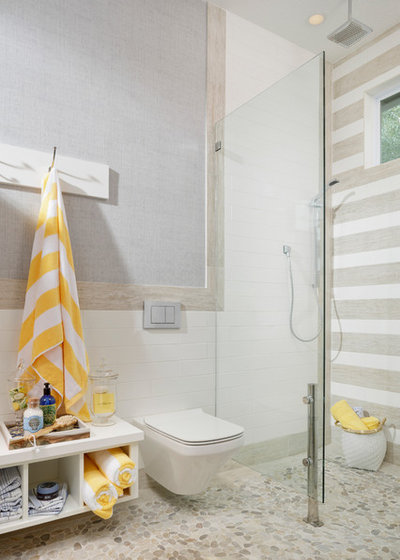
Homeowners’ request: “They had just purchased this home and wanted a second guest and pool bath but had no idea where it might go. They also wanted the home to be easy living. The husband travels frequently — he’s a pilot for a major airline — and she’s a busy stay-at-home mom with three small and very active boys. I wanted a ‘car wash’ where all three could shower at once or at least be all captured in the room at one time while the mom washed the others, but still be presentable for frequent pool guests.”
Plan of attack: “I started with what I would have liked as a mother of six, all very close in age. This bathroom would have made my life a lot easier. Besides being pretty, it needs almost zero maintenance. Tiled walls and a wall-hung toilet makes for quick cleanup — we’re talking three boys here. The floating combo cabinet-bench-cubby keeps things off the floor and makes for easy cleanup and gives a place to sit with storage beneath. Notice even the shower glass is raised off the floor. You could seriously hose down the entire room and towel dry it.”
Why it works: “It’s not just pretty but practical. The classic wall-mounted sink is charming and will continue to be a classic in design. Tiled walls are again charming with a purpose: They are durable and basically indestructible. The vinyl wall covering wears like iron and will withstand whatever comes its way. This room will look as darling in 10 years as it does today, and that’s good design to me.”
Cindy Aplanalp-Yates & Chairma Design Group
Designer secret: “Look for shapes you like and keep coming back to. In this case the client really liked elongated things, so we used the wood-looking tile planking and elongated subway tile to meet her design aesthetic.”
Take-away: “There is no way to prepare people for the amount of dust in home construction. Remodeling is a long process. Set up realistic expectations and remind of those expectations. It’s messier and takes longer than expected. If possible, move completely out and have an alternate place to live during the process. If you can’t do that, definitely take a vacation during the process and have a plan for meals and ways that you can add order to your life. It is hard to have strangers in your home, and the noise and dust is unsettling. Know this on the front end and plan for it.”
The nitty-gritty: Wall tile: Natural Wilmington in white (6 by 24 inches), alternating with Streamline Artic White polished (4 by 6 inches), both by Thorntree; floor tile: Sand Sliced Pebbles, Thorntree; cabinet paint: Pure White SW 7005 in satin finish, Sherwin-Williams; wall covering: Bankun raffia in Light Gray T14138, Thibaut; lighting: George pendant in polished chrome finish with deep cone shade with pinstripes, Rejuvenation
Team involved: Matt Sneller of Matt Sneller Custom Homes and Remodeling (contractor)
More:
12 Design Tips to Make a Small Bathroom Better
Find a bathroom designer near you

0 comments:
Post a Comment